Установка:
Код кидать в таблицу стилей CSS, а к ссылке приписать класс той кнопки которую вы выбирите.
Например: <a href="#" class="button">Ссылка</a>
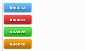
Синяя кнопка:Код .button {
padding: 7px 20px;
font-size: 13px;
font-weight: bold;
color: #FFFFFF;
text-align: center;
border: solid 1px #73C8F0;
cursor: pointer;
border-radius: 5px;
-moz-border-radius: 5px;
-webkit-border-radius: 5px;
background: -moz-linear-gradient(0% 100% 90deg, #73C2FD, #2E8CE3);
background: -webkit-gradient(linear, 0% 0%, 0% 100%, from(#73C2FD), to(#2E8CE3));
background: linear-gradient(#73C2FD,#2E8CE3);
box-shadow: inset 0 1px 0 0 #FFFFFF;
-moz-box-shadow: 0 1px 3px rgba(0,0,0,0.5);
-webkit-box-shadow: 0 1px 3px rgba(0,0,0,0.5);
border-bottom: 1px solid rgba(0,0,0,0.25);
text-shadow: 0 -1px 1px rgba(0,0,0,0.25);
font-size: 13px;
text-shadow: 0px 1px 2px #000;
}
.button:hover {
background: -moz-linear-gradient(0% 100% 90deg, #59C2FF, #2E69E3);
background: -webkit-gradient(linear, 0% 0%, 0% 100%, from(#59C2FF), to(#2E69E3));
background: linear-gradient(#59C2FF,#2E69E3);
}
.button:active {
background: -moz-linear-gradient(0% 100% 90deg, #59C2FF, #2E69E3);
background: -webkit-gradient(linear, 0% 0%, 0% 100%, from(#59C2FF), to(#2E69E3));
background: linear-gradient(#59C2FF,#2E69E3);
box-shadow: inset 1px 1px 0 0 #004A7F;
-moz-box-shadow: inset 1px 1px 0 0 #004A7F;
-webkit-box-shadow: inset 1px 1px 0 0 #004A7F;
box-shadow: inset 4px 4px 10px #2481D5;
padding: 8px 19px 6px 21px;
}
a.button:link {text-decoration: none;color: #fff;text-shadow: 0px 1px 2px #000;}
a.button:hover{text-decoration: none;color: #fff;text-shadow: 0px 1px 2px #000;}
a.button:active{text-decoration: none;color: #fff;text-shadow: 0px 1px 2px #000;}
a.button:visited{text-decoration: none;color: #fff;text-shadow: 0px 1px 2px #000;} Красная кнопка: Код .button2 {
padding: 7px 20px;
font-size: 13px;
font-weight: bold;
color: #FFFFFF;
text-align: center;
border: solid 1px #F04538;
cursor: pointer;
border-radius: 5px;
-moz-border-radius: 5px;
-webkit-border-radius: 5px;
background: -moz-linear-gradient(0% 100% 90deg, #FF4C46, #C11919);
background: -webkit-gradient(linear, 0% 0%, 0% 100%, from(#FF4C46), to(#C11919));
background: linear-gradient(#FF4C46,#C11919);
box-shadow: inset 0 1px 0 0 #FFFFFF;
-moz-box-shadow: 0 1px 3px rgba(0,0,0,0.5);
-webkit-box-shadow: 0 1px 3px rgba(0,0,0,0.5);
border-bottom: 1px solid rgba(0,0,0,0.25);
font-size: 13px;
text-shadow: 0px 1px 2px #000;
}
.button2:hover {
background: -moz-linear-gradient(0% 100% 90deg, #FF4C46, #A61616);
background: -webkit-gradient(linear, 0% 0%, 0% 100%, from(#FF4C46), to(#A61616));
background: linear-gradient(#FF4C46,#A61616);
}
.button2:active {
background: -moz-linear-gradient(0% 100% 90deg, #FF4C46, #BB2B2B);
background: -webkit-gradient(linear, 0% 0%, 0% 100%, from(#FF4C46), to(#BB2B2B));
background: linear-gradient(#FF4C46,#BB2B2B);
-moz-box-shadow: inset 1px 1px 0 0 #AE1E1E;
-webkit-box-shadow: inset 1px 1px 0 0 #AE1E1E;
box-shadow: inset 4px 4px 10px #AE1E1E;
padding: 8px 19px 6px 21px;
}
a.button2:link {text-decoration: none;color: #fff;text-shadow: 0px 1px 2px #000;}
a.button2:hover{text-decoration: none;color: #fff;text-shadow: 0px 1px 2px #000;}
a.button2:active{text-decoration: none;color: #fff;text-shadow: 0px 1px 2px #000;}
a.button2:visited{text-decoration: none;color: #fff;text-shadow: 0px 1px 2px #000;} Зеленая кнопка: Код .button3 {
padding: 7px 20px;
font-size: 13px;
font-weight: bold;
color: #FFFFFF;
text-align: center;
border: solid 1px #37C92C;
cursor: pointer;
border-radius: 5px;
-moz-border-radius: 5px;
-webkit-border-radius: 5px;
background: -moz-linear-gradient(0% 100% 90deg, #62F451, #19AB11);
background: -webkit-gradient(linear, 0% 0%, 0% 100%, from(#62F451), to(#19AB11));
background: linear-gradient(#62F451,#19AB11);
box-shadow: inset 0 1px 0 0 #FFFFFF;
-moz-box-shadow: 0 1px 3px rgba(0,0,0,0.5);
-webkit-box-shadow: 0 1px 3px rgba(0,0,0,0.5);
border-bottom: 1px solid rgba(0,0,0,0.25);
text-shadow: 0 -1px 1px rgba(0,0,0,0.25);
font-size: 13px;
text-shadow: 0px 1px 2px #000;
}
.button3:hover {
background: -moz-linear-gradient(0% 100% 90deg, #62F451, #069803);
background: -webkit-gradient(linear, 0% 0%, 0% 100%, from(#62F451), to(#069803));
background: linear-gradient(#62F451,#069803);
}
.button3:active {
background: -moz-linear-gradient(0% 100% 90deg, #62F451, #1BAD18);
background: -webkit-gradient(linear, 0% 0%, 0% 100%, from(#62F451), to(#1BAD18));
background: linear-gradient(#62F451,#1BAD18);
box-shadow: inset 1px 1px 0 0 #26B81D;
-moz-box-shadow: inset 1px 1px 0 0 #26B81D;
-webkit-box-shadow: inset 1px 1px 0 0 #26B81D;
padding: 8px 19px 6px 21px;
box-shadow: inset 4px 4px 10px #309A30;
}
a.button3:link {text-decoration: none;color: #fff;text-shadow: 0px 1px 2px #000;}
a.button3:hover{text-decoration: none;color: #fff;text-shadow: 0px 1px 2px #000;}
a.button3:active{text-decoration: none;color: #fff;text-shadow: 0px 1px 2px #000;}
a.button3:visited{text-decoration: none;color: #fff;text-shadow: 0px 1px 2px #000;} Оранжевая кнопка: Код .button4 {
padding: 7px 20px;
font-size: 13px;
font-weight: bold;
color: #FFFFFF;
text-align: center;
border: solid 1px #F19700;
cursor: pointer;
border-radius: 5px;
-moz-border-radius: 5px;
-webkit-border-radius: 5px;
background: -moz-linear-gradient(0% 100% 90deg, #FFA500, #BC6200);
background: -webkit-gradient(linear, 0% 0%, 0% 100%, from(#FFA500), to(#BC6200));
background: linear-gradient(#FFA500,#BC6200);
box-shadow: inset 0 1px 0 0 #FFFFFF;
-moz-box-shadow: 0 1px 3px rgba(0,0,0,0.5);
-webkit-box-shadow: 0 1px 3px rgba(0,0,0,0.5);
border-bottom: 1px solid rgba(0,0,0,0.25);
text-shadow: 0 -1px 1px rgba(0,0,0,0.25);
font-size: 13px;
text-shadow: 0px 1px 2px #000;
}
.button4:hover {
background: -moz-linear-gradient(0% 100% 90deg, #FFA500, #AC5200);
background: -webkit-gradient(linear, 0% 0%, 0% 100%, from(#FFA500), to(#AC5200));
background: linear-gradient(#FFA500,#AC5200);
}
.button4:active {
background: -moz-linear-gradient(0% 100% 90deg, #FFA500, #B35907);
background: -webkit-gradient(linear, 0% 0%, 0% 100%, from(#FFA500), to(#B35907));
background: linear-gradient(#FFA500,#B35907);
box-shadow: inset 1px 1px 0 0 #AD530A;
-moz-box-shadow: inset 1px 1px 0 0 #A34900;
-webkit-box-shadow: inset 1px 1px 0 0 #A34900;
padding: 8px 19px 6px 21px;
box-shadow: inset 4px 4px 10px #AD530A;
}
a.button4:link {text-decoration: none;color: #fff;text-shadow: 0px 1px 2px #000;}
a.button4:hover{text-decoration: none;color: #fff;text-shadow: 0px 1px 2px #000;}
a.button4:active{text-decoration: none;color: #fff;text-shadow: 0px 1px 2px #000;}
a.button4:visited{text-decoration: none;color: #fff;text-shadow: 0px 1px 2px #000;}
|

 662 |
662 |
 0 |
Дата:
0 |
Дата: